United Sugar Producers & Refiners
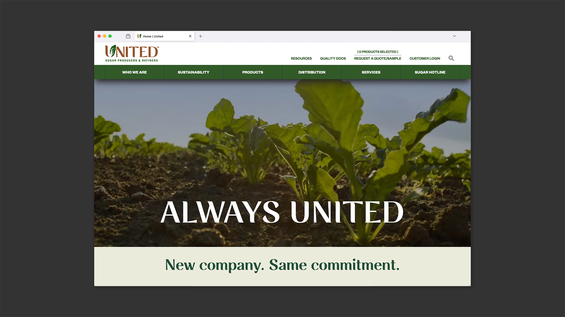
Always united.
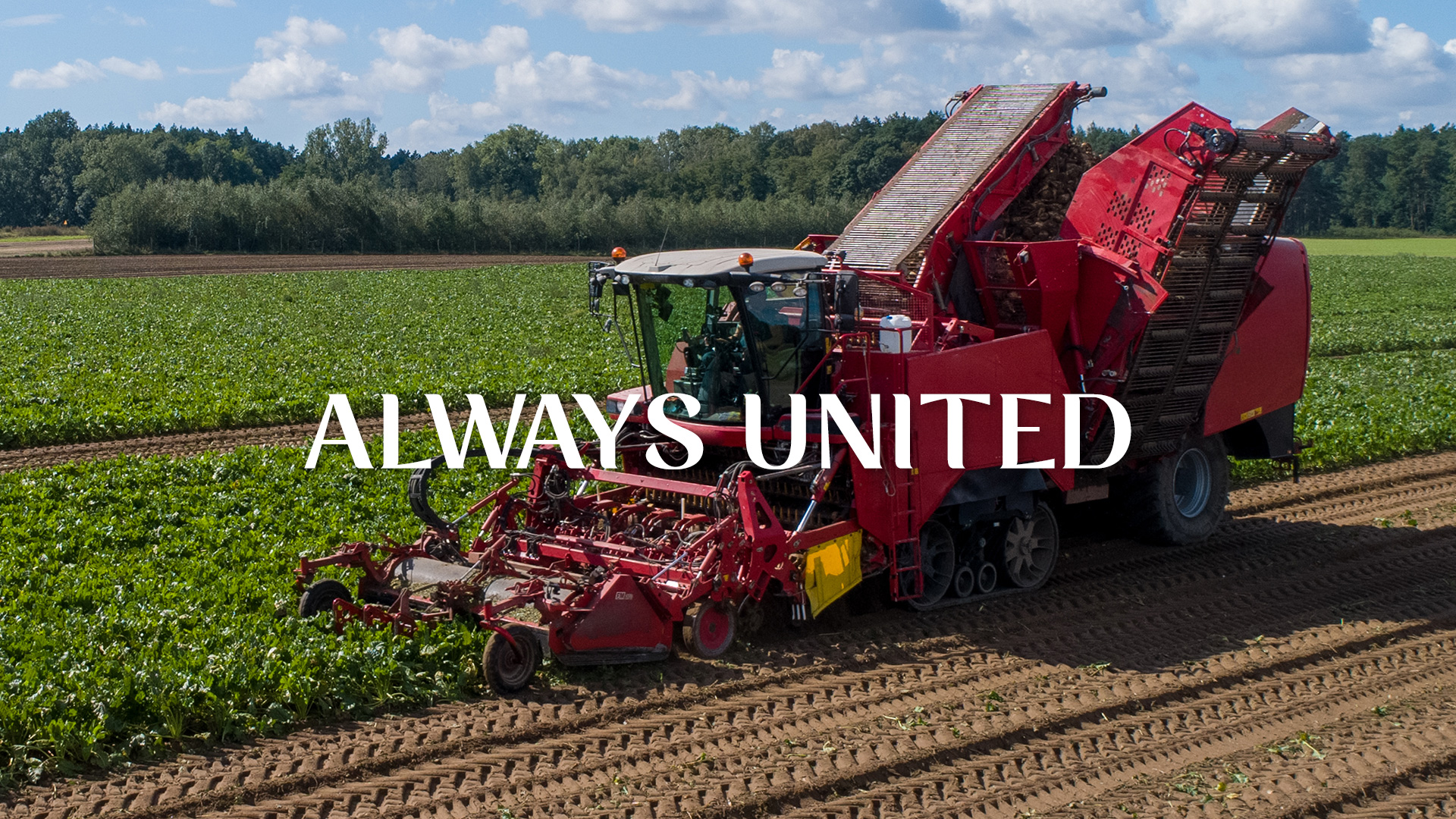
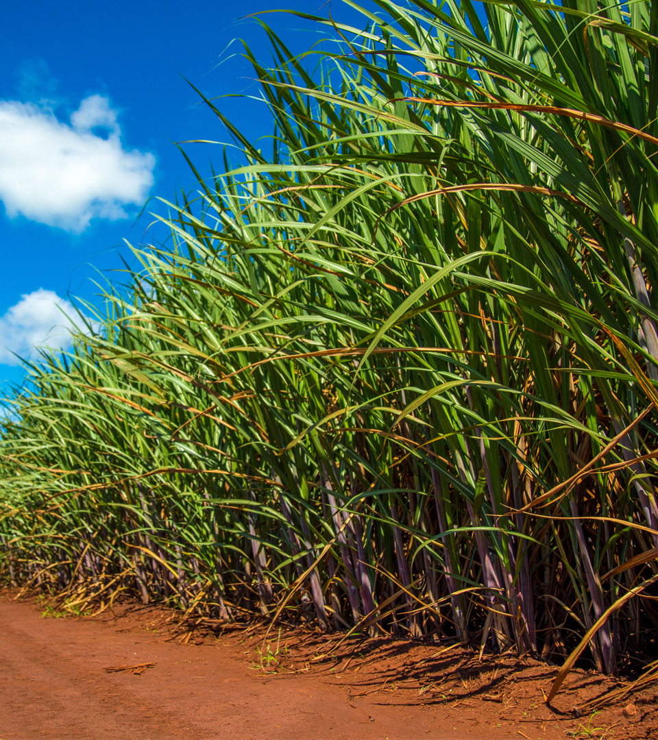
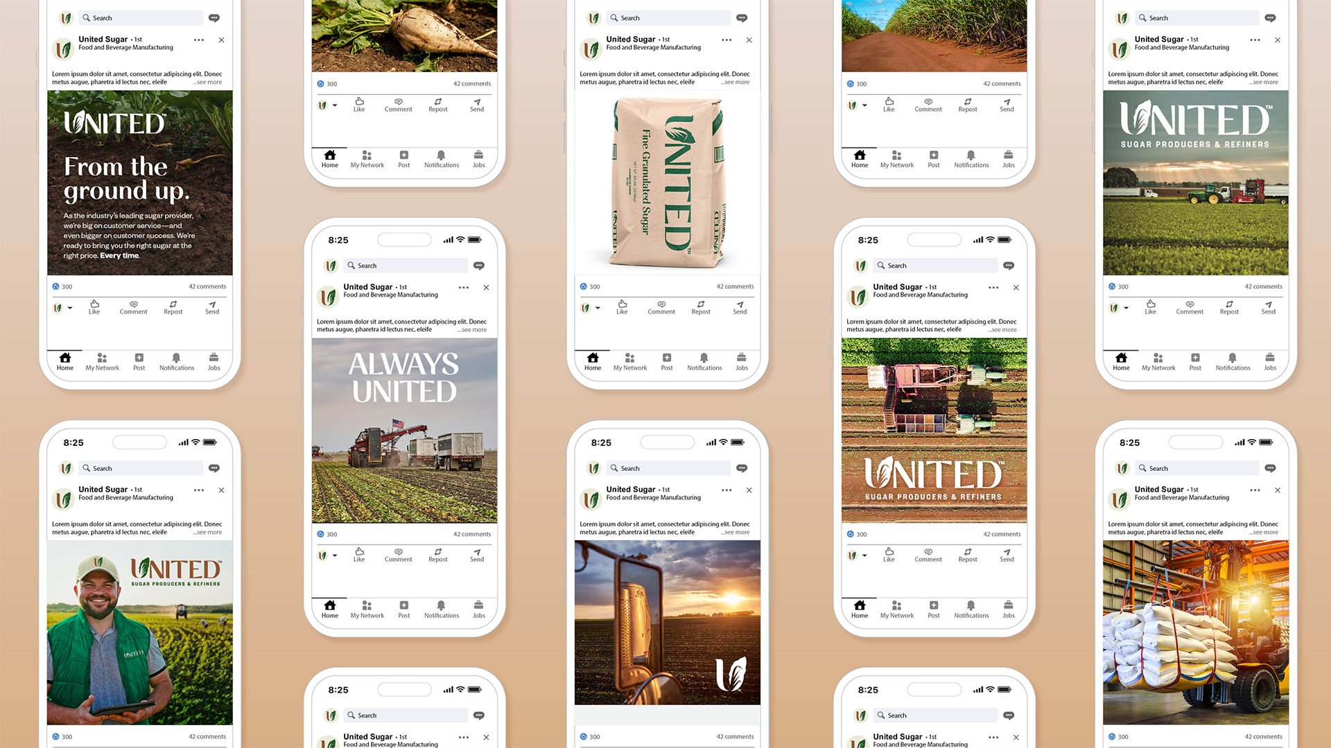
United Sugar Producers & Refiners is a customer-focused sugar provider, serving industrial and retail buyers nationwide. With the recent addition of the Savannah refinery, we saw an opportunity to re-evaluate our brand identity and messaging. Our challenge was to create a flexible design system that unites the two products we represent—sugar beet and sugar cane—into a cohesive and versatile brand.
CLIENT: UNITED SUGAR
AGENCY: CALLAHAN
ROLE: CONCEPT DESIGN, CREATIVE/ART DIRECTION
Our Approach
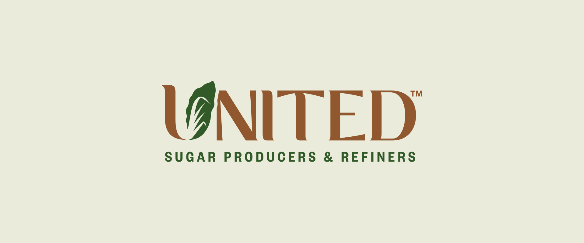
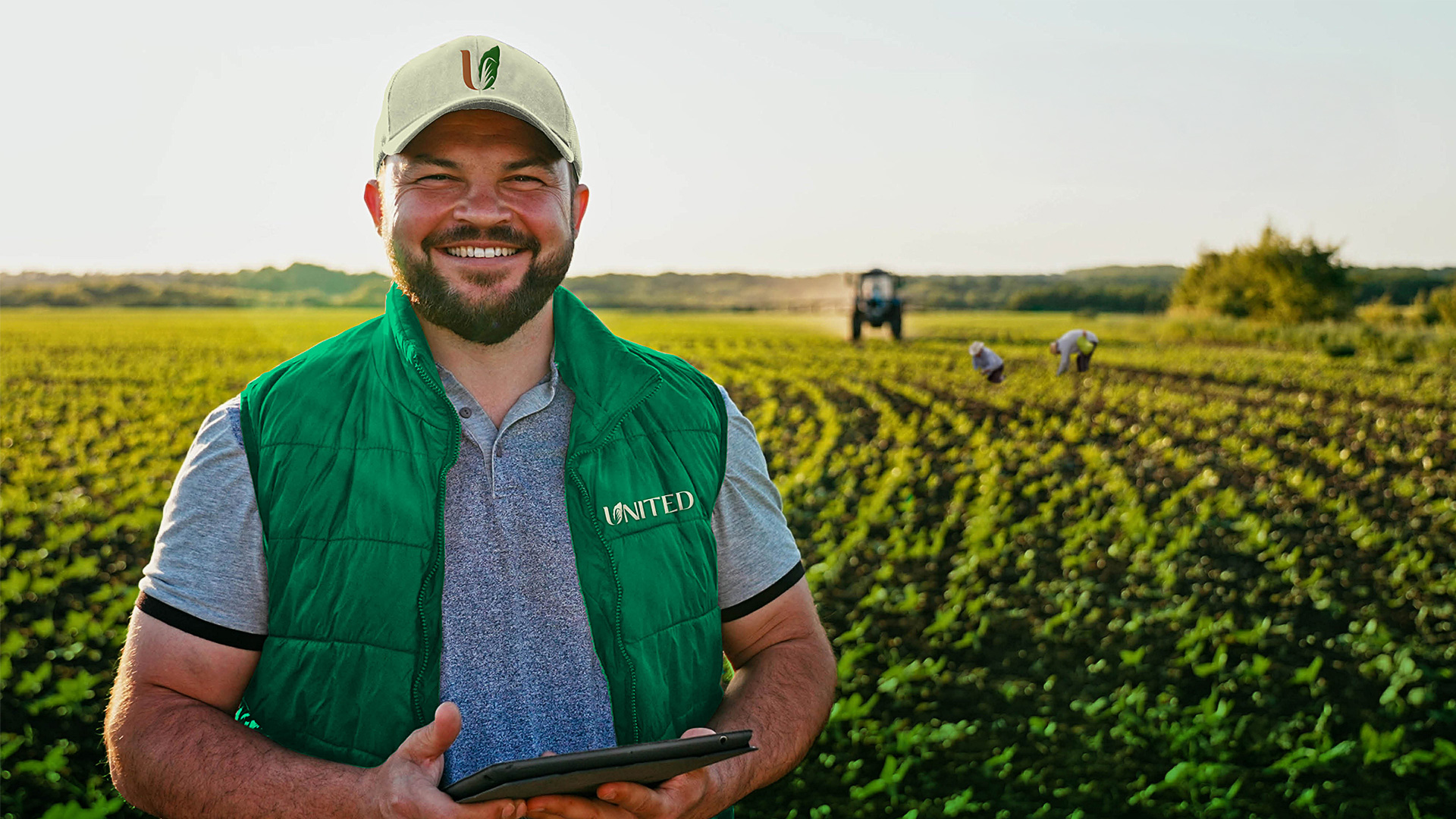
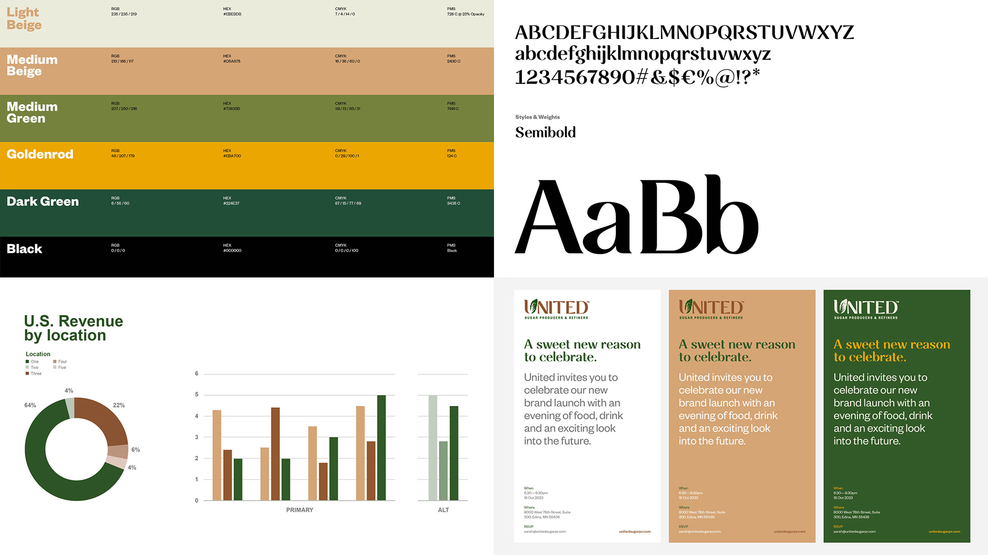
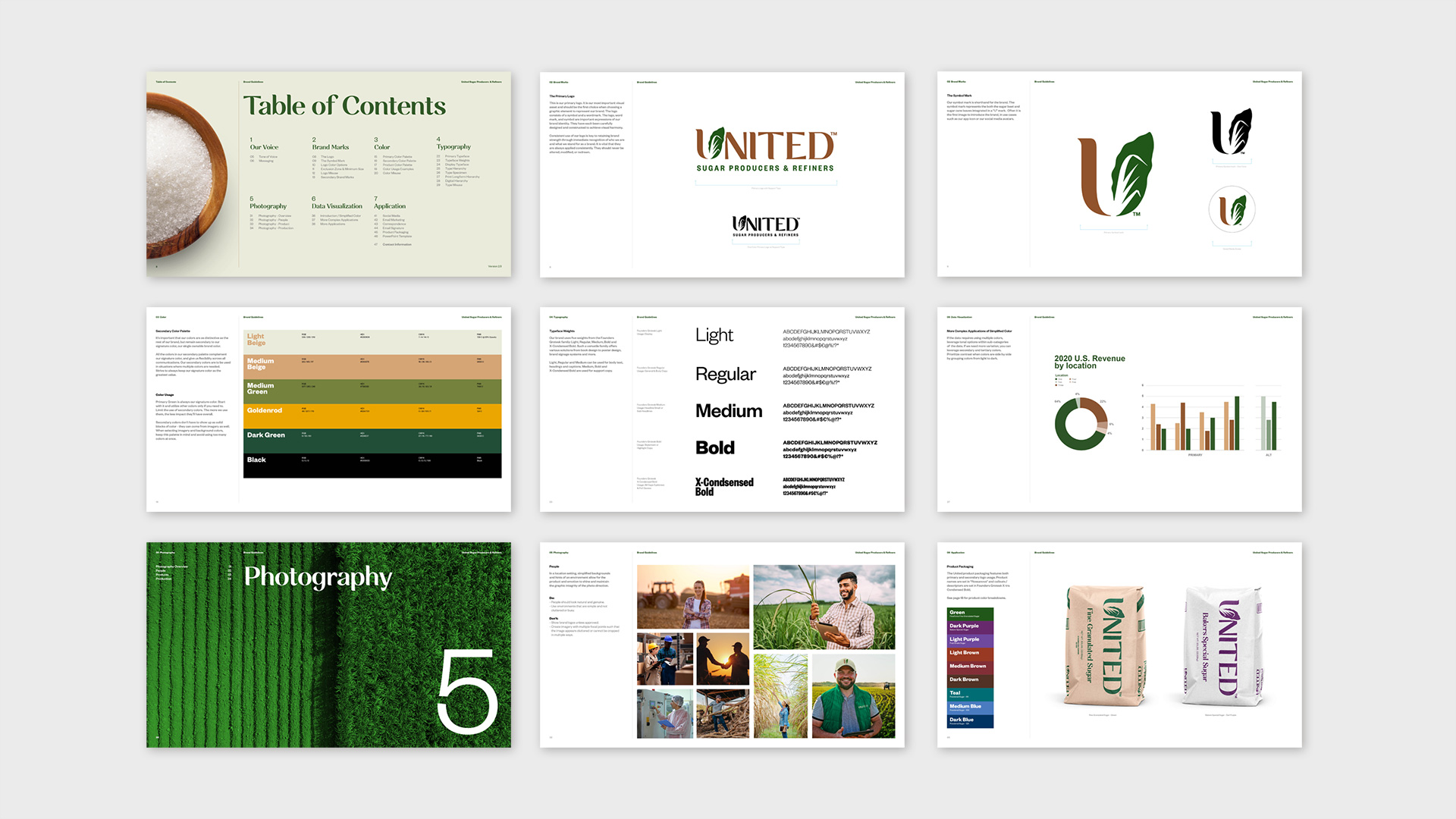
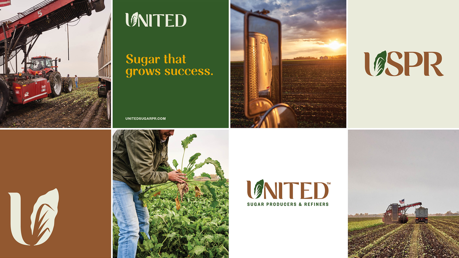
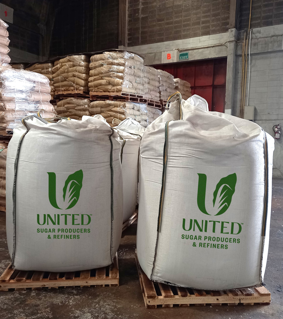
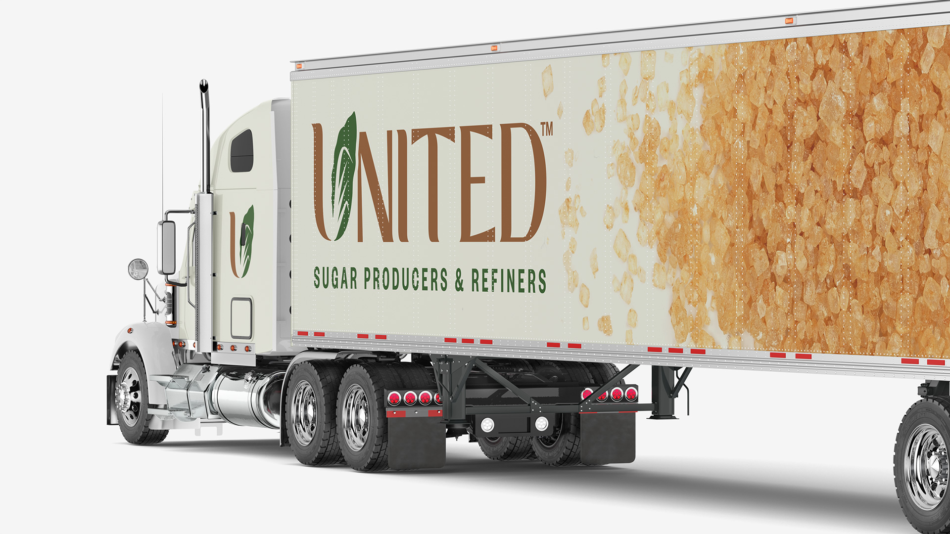
To distinguish United Sugar Producers & Refiners as a cooperative, we recognized the need for a flexible, comprehensive brand system that conveys both warmth and forward-thinking energy. By embracing a distinctive serif logo type, a warm color palette, and elegant typography, we crafted a brand identity that sets them apart from the traditional design landscape.
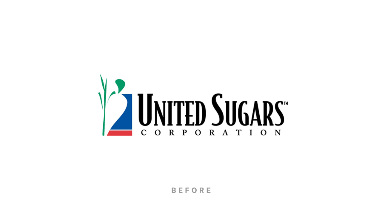
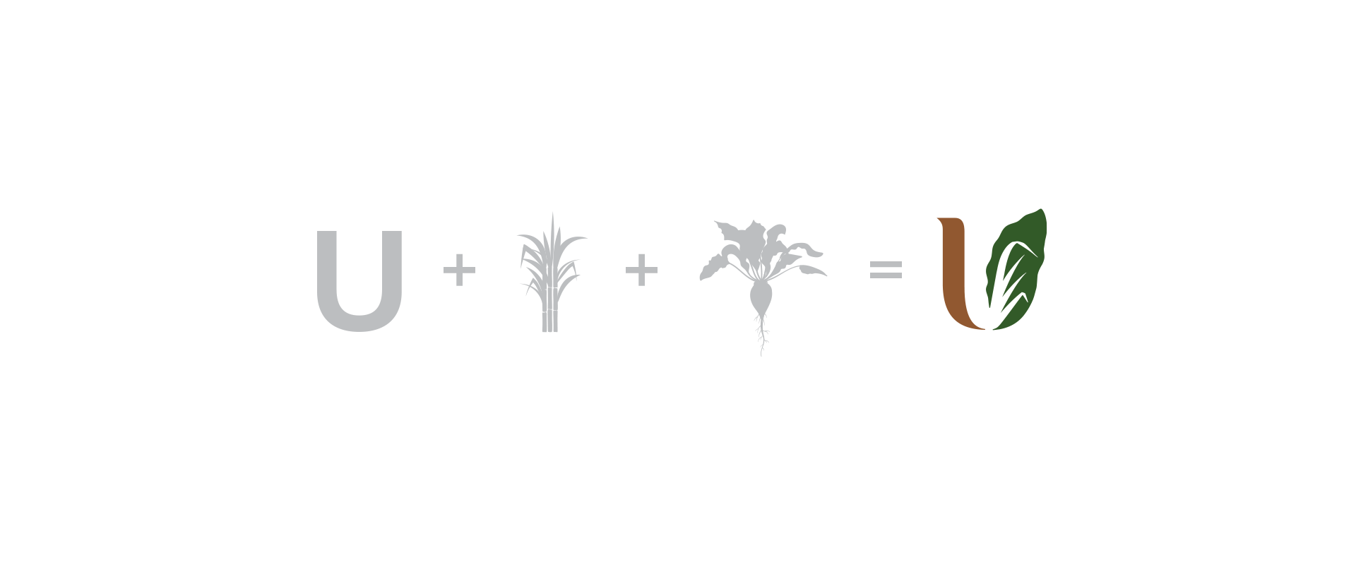
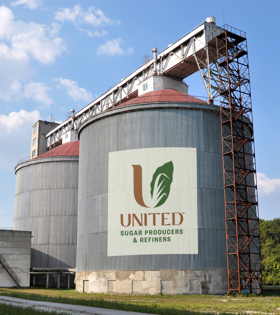
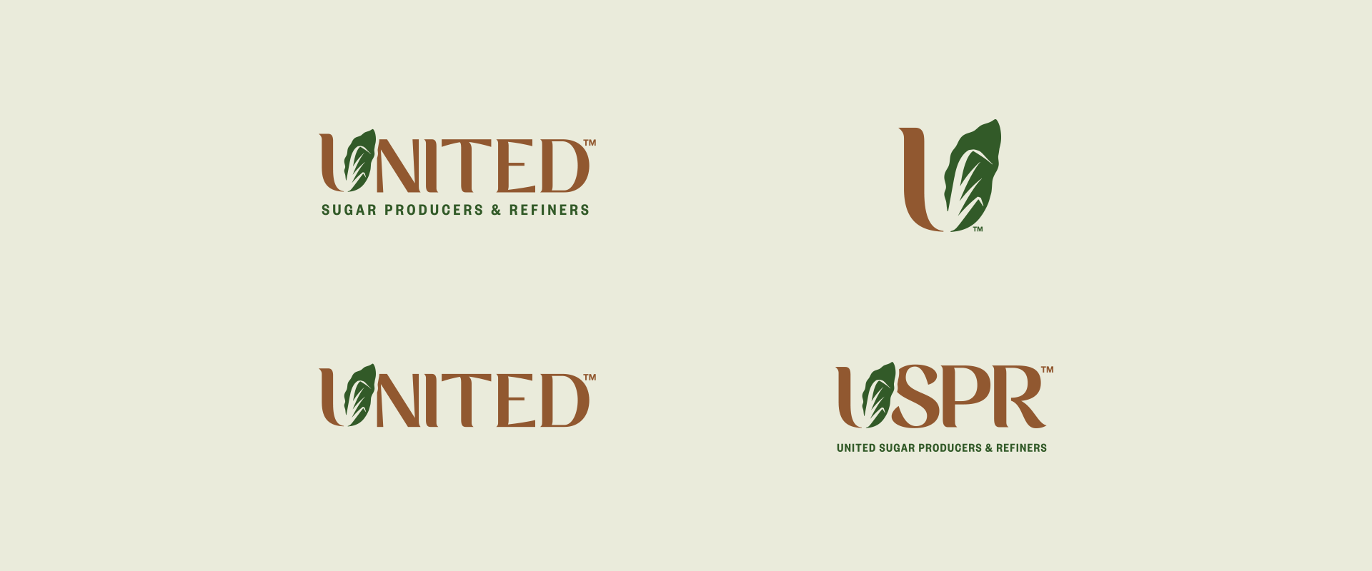
The ‘leaf-device’ – United’s most recognizable asset – is the foundation for the vibrant new identity. The leaves combine sugar beet and sugar cane leaves to form the ‘U’ in United, symbolizing not only the products United represents, but also the unity of the cooperative of farms and farmers behind the brand.




Inquires: hello@danrood.com | About